Watch Me Grow
Launching a trust-driven website to support childcare enrollment growth
Role: Product Designer (UX Strategy & Web Design)
Duration: 4 Weeks
Tool: Figma, Framer

Overview
When Watch Me Grow expanded to a second location, enrollment relied heavily on informal referrals with no structured digital presence. I approached the project as a UX challenge: designing a clear and trustworthy enrollment pathway for parents evaluating childcare options.
Led the 0→1 strategy, information architecture, and responsive implementation.
From Informal to Structured
Before
• Enrollment is dependent on referrals
• No clear content hierarchy
• Two locations without differentiation
• Unclear next steps for new families

After
• Clear information architecture
• Trust-driven homepage hierarchy
• Defined decision journey
• Location-based differentiation
• Guided enrollment conversion flow
Problem Framing
As Watch Me Grow expanded to a second location, enrollment relied primarily on informal referrals with no structured digital presence.
The business request was to “build a website.”
The underlying UX problem was different: parents lacked a clear way to evaluate programs, differentiate locations, and understand next steps.
I reframed the project as designing a structured evaluation pathway for parents navigating childcare decisions.
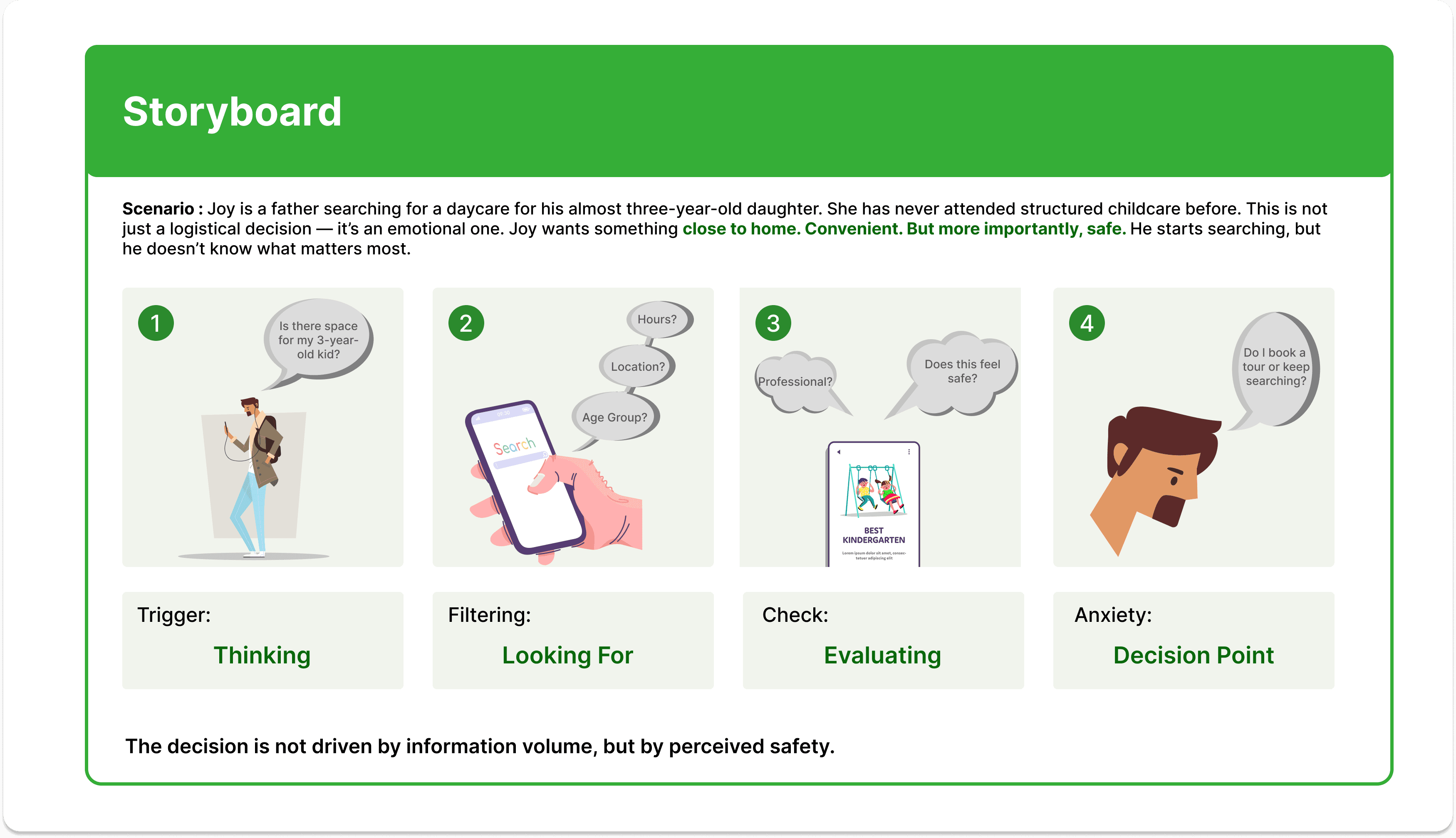
Behavioral Mapping
A behavioral storyboard of how parents evaluate childcare options.
Storyboard into Design
Insight 1 :
Parents scan before they read
→Decision:
Hero uses a concise value statement + primary CTA.
Insight 2 :
Parents first evaluate fit before philosophy
→Decision:
The programs section is placed above Philosophy.
Insight 3:
Trust is built through tangible evidence.
→Decision:
Real environment photos prioritized over decorative visuals.
Define the Enrollment Journey
To support enrollment growth, I mapped a simplified parent decision sequence.
Aligning the site structure with this journey reduced decision friction and clarified next steps.

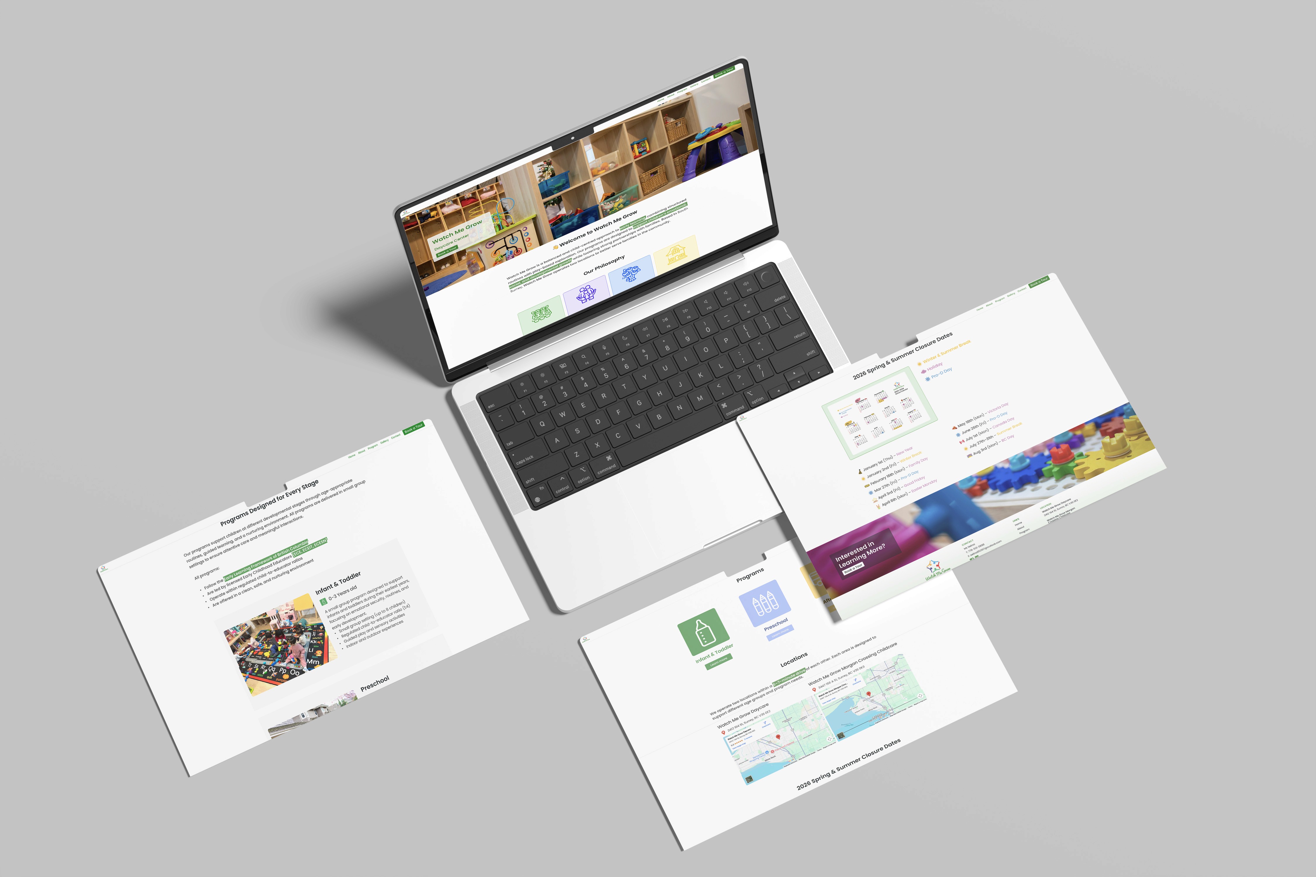
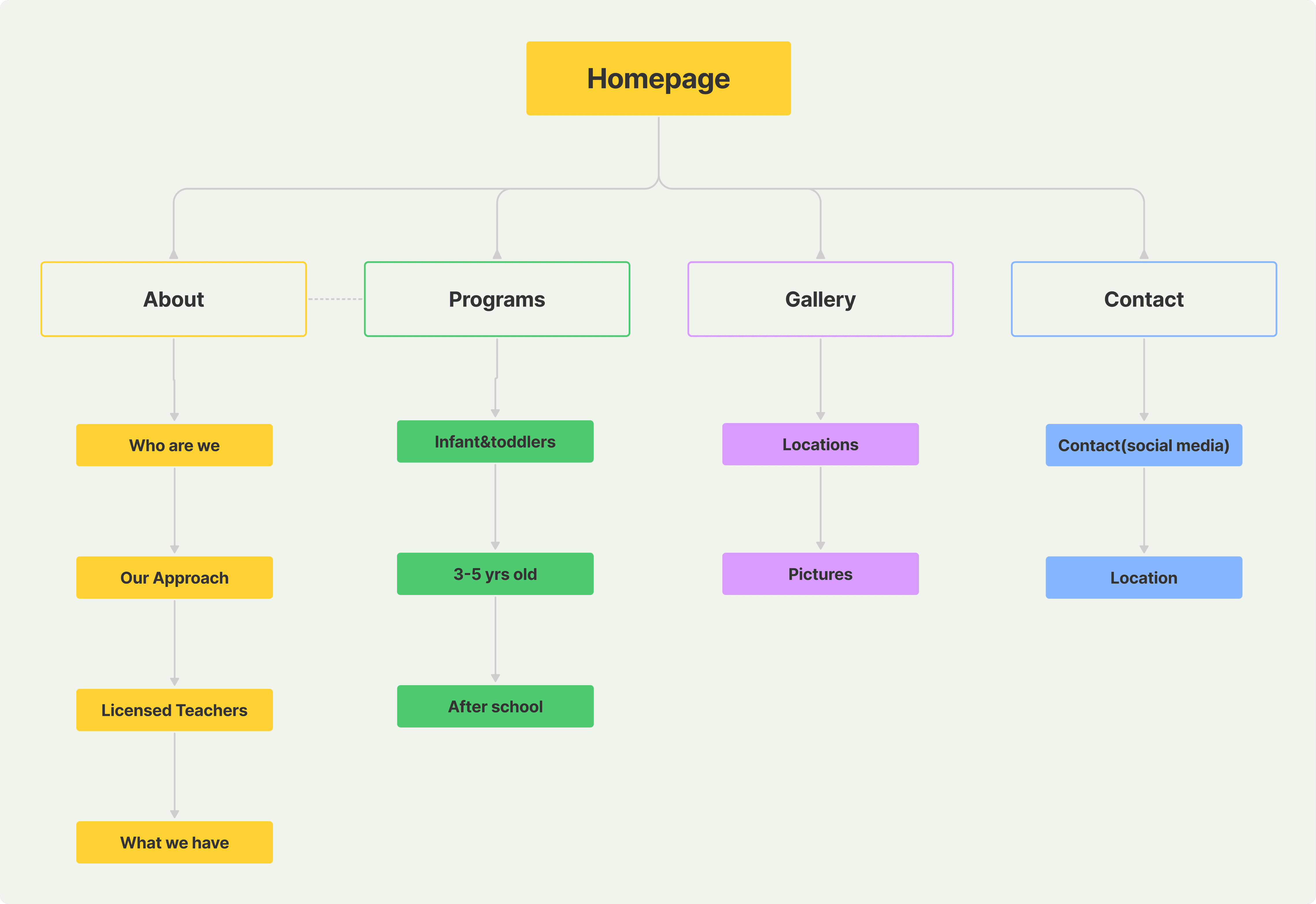
Information Architecture
This structure replaced scattered information with a guided decision hierarchy.
Design Principle
The homepage was not designed to present information — It was structured to reduce hesitation.
The hierarchy was designed to scale responsively, ensuring that key reassurance signals remain visible even on smaller screens.
Based on behavioural insights, the layout prioritizes:
Immediate reassurance
Practical fit
Emotional validation
Clear commitment path
A homepage structured around parental decision psychology:

The structure guides parents from reassurance to commitment without overwhelming them.
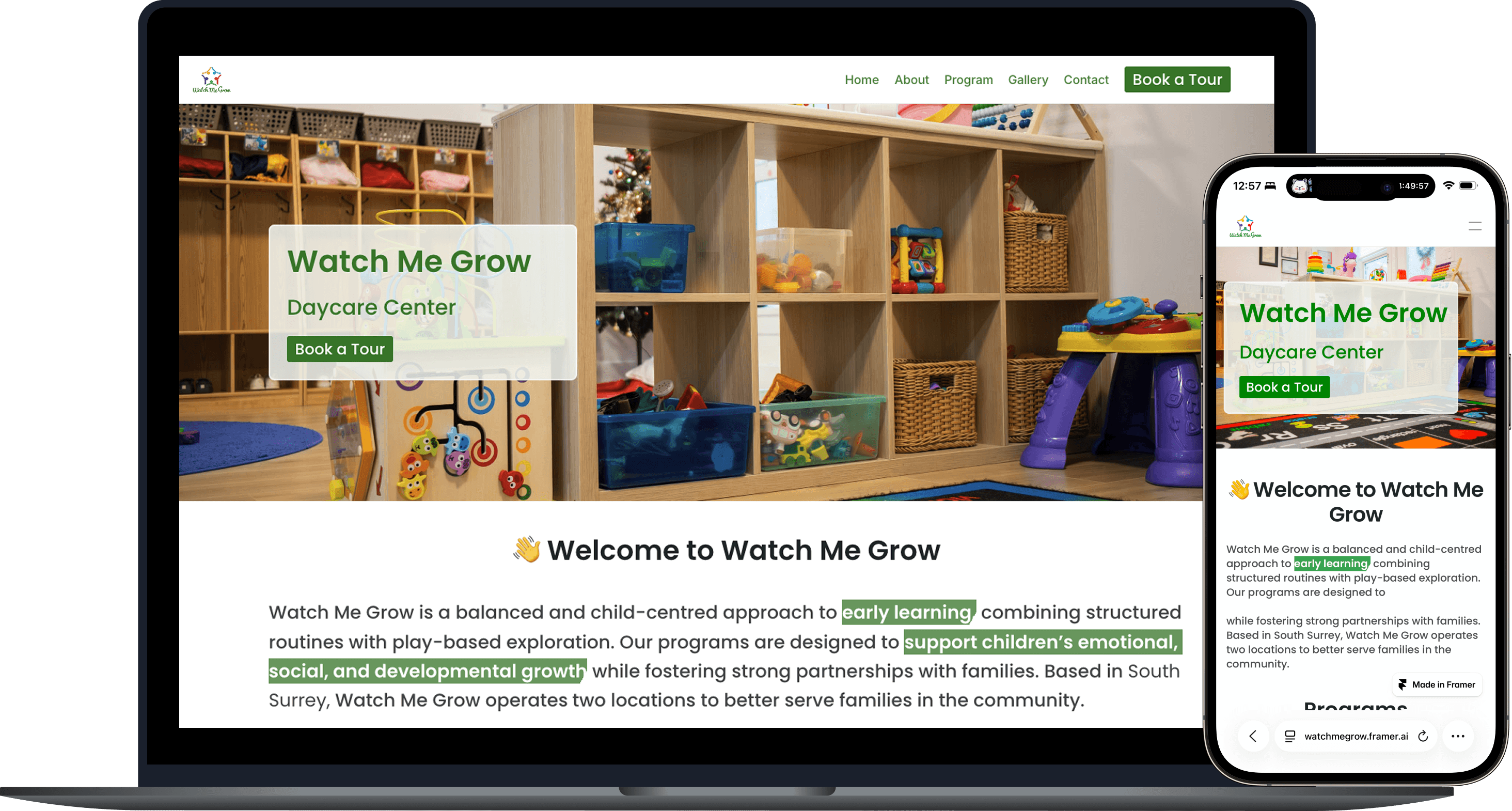
Final Deliverable
Enrollment-focused responsive homepage